Simple Is the Hard Part – Tara Wins UX Design Awards 2026
Crypto treated complexity like a mandatory entry fee for too long. We set out to change that. Here's the first look at how TARA was built to feel simple, and why a design jury took notice.
Chances are, you've walked away from a crypto app halfway through setting it up.
Maybe it handed you twelve random words and told you that if you ever lost them, your money was gone for good.
Or maybe it threw a 42-character string at you and expected you to double-check every single letter and number.
Or maybe you just wanted to send twenty bucks to a friend, got hit with a prompt asking which network to route it through, and decided it wasn't worth the headache.
Owning your money shouldn't feel confusing
For a long time, the crypto world basically treated all that friction as the price of admission. The prevailing mindset was that if you wanted true ownership, you just had to put up with the complexity.
And people paid for that in real ways: setups abandoned halfway through, savings left on exchanges because self-custody felt terrifying, and transfers sent into the void, never to be seen again.
We knew from day one that we didn't want to build something like that.
The complexity is real. It's just our job, not yours.
Here is something Andy, our head of design, keeps pointing out:
For a long time, there has been a perception that crypto can't be simple to use or easy to understand. At TARA, we're changing that. Every part of the product is designed to take advantage of Web3 rails while making the experience as simple as using a neobank.
It sounds straightforward enough on paper. But making things simple in practice? That's the hardest part.
Piling on new features is easy. The real craft lies in stripping things back, hiding the heavy machinery under the hood, and turning complicated tasks into intuitive, everyday actions.
How this actually plays out in TARA
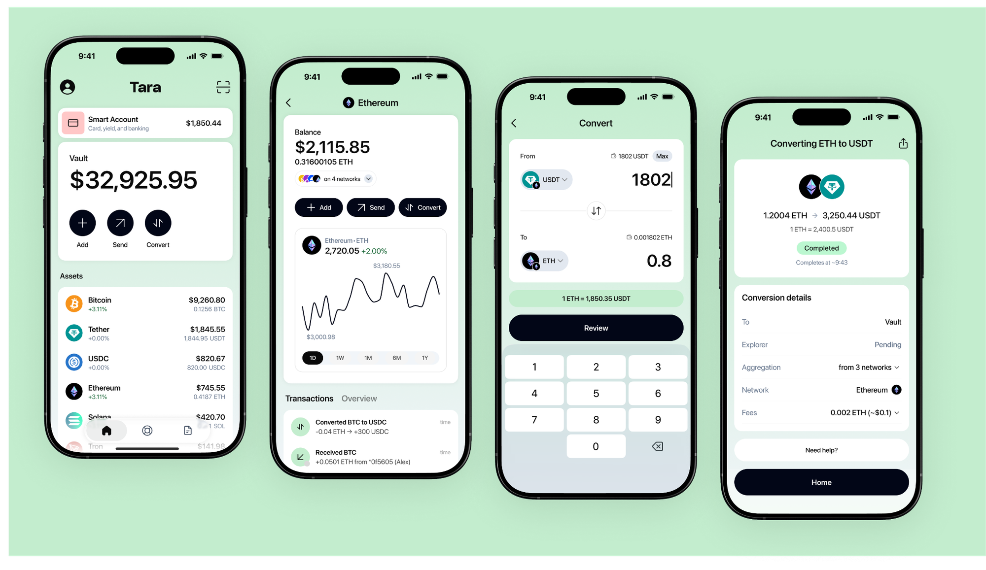
Instead of forcing you to keep track of the same coin split across four different networks, you get one clean balance per currency.
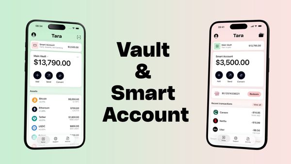
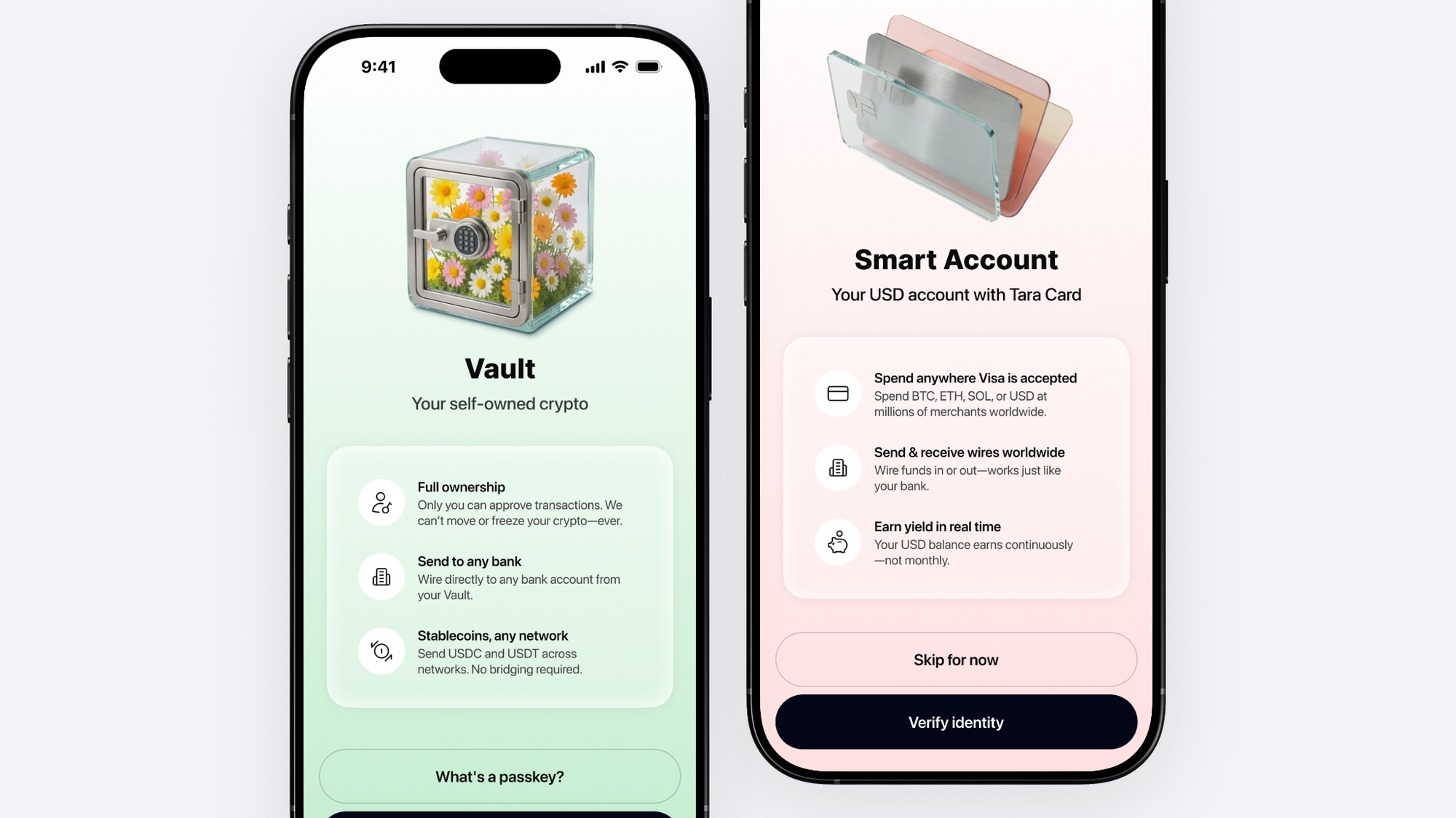
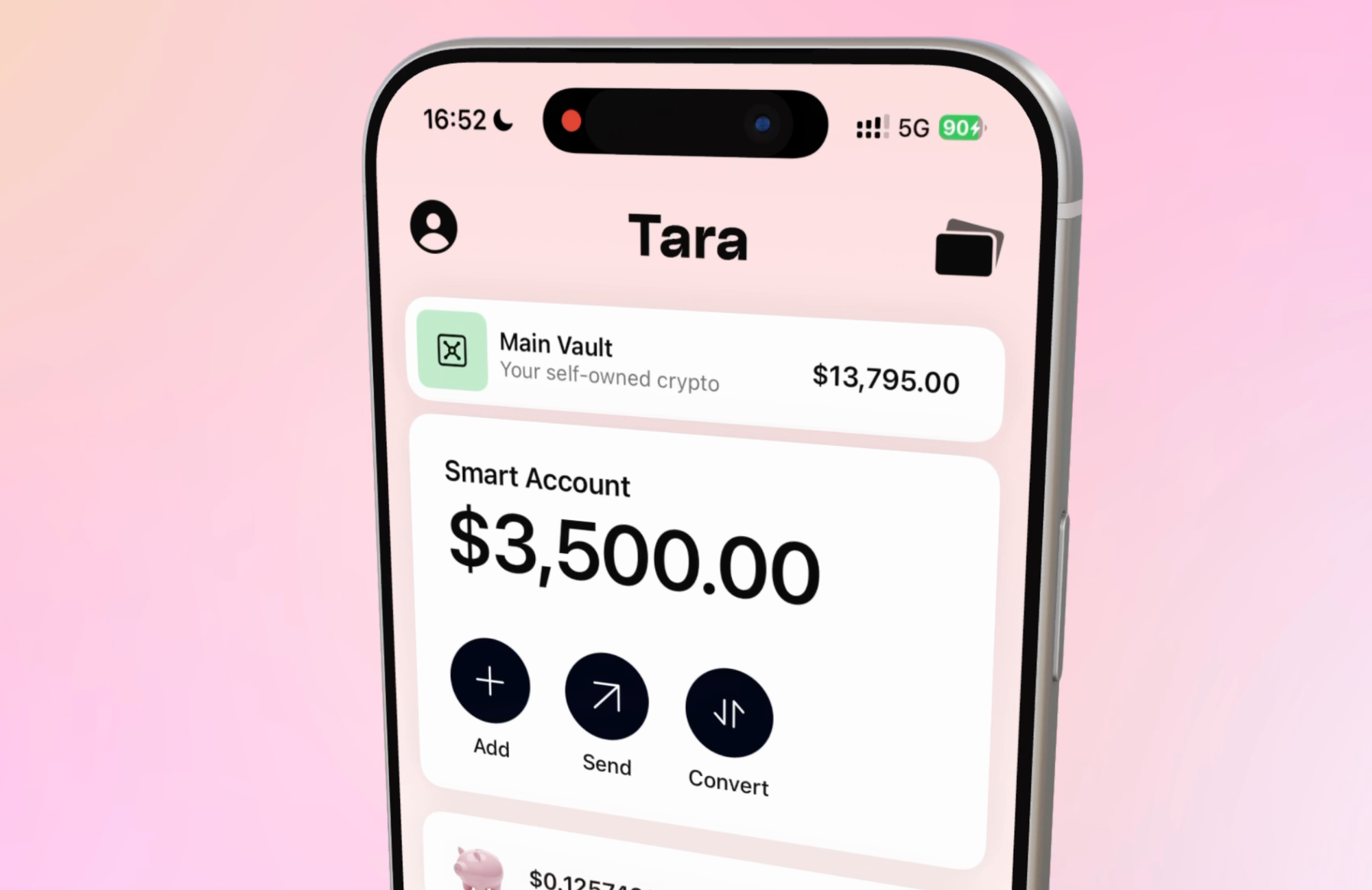
We built a clear separation with a Smart Account for daily spending and a Vault for holding, so you always know exactly which bucket you're interacting with.
And because of how the Vault is engineered, you won't ever have to write down or guard a twelve-word seed phrase.
None of these design choices are just for looks. Every single one eliminates a point of confusion or a mistake waiting to happen.
Awards are great, but this is just the beginning
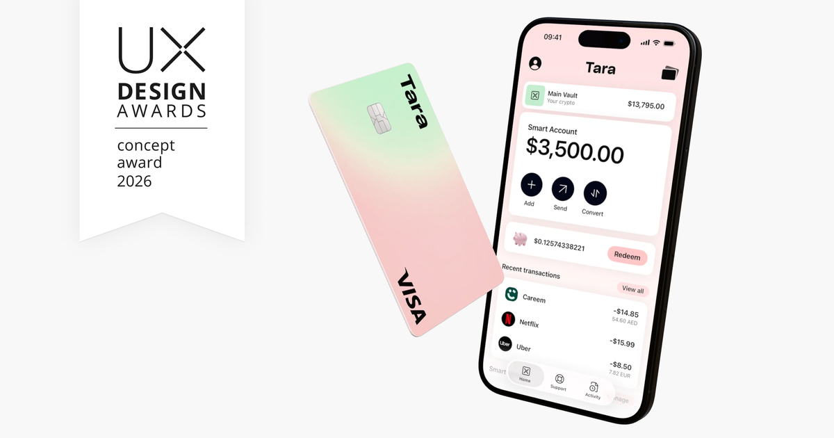
Recently, the jury at the UX Design Awards recognized the work we've put into building TARA.
While we're honored by the nod, an award is just confirmation, not the ultimate goal. What really matters is whether the app feels intuitive and effortless the moment you pick it up.
That's the standard we hold ourselves to. Over the next few weeks, we're going to walk you through the thinking behind each piece of the puzzle—from unified balances and account separation to the tiny details that go unnoticed until they're missing.
Consider this post the starting line.
Why this matters for you
Thoughtful design in crypto is the difference between having money you can seamlessly use and money you're too nervous to touch.
We're rolling TARA out in friends and family mode first, with public access coming soon right after. You can check it out over at tara.com.
Keep what's yours, spend what you need, and stay in total control of where it all goes.
Money on your side.